What a small-business website actually needs (and what it doesn't)
A plain-English guide to the pages, structure and proof a Perth small-business website needs to bring in work, and the extras you can safely skip.
A small-business website in Perth has one job: turn someone who's just heard of you into someone who gets in touch. Most fall short not because they're ugly, but because they bury that job under things that don't matter. Here's what earns its place, and what you can skip.
Say what you do, and where, in the first screen
Within the first screen, a visitor should know what you do, who it's for, and that you're in Perth (or wherever you serve). "Bricklayer in Joondalup: residential and commercial" beats a clever slogan every time. Plain wins.
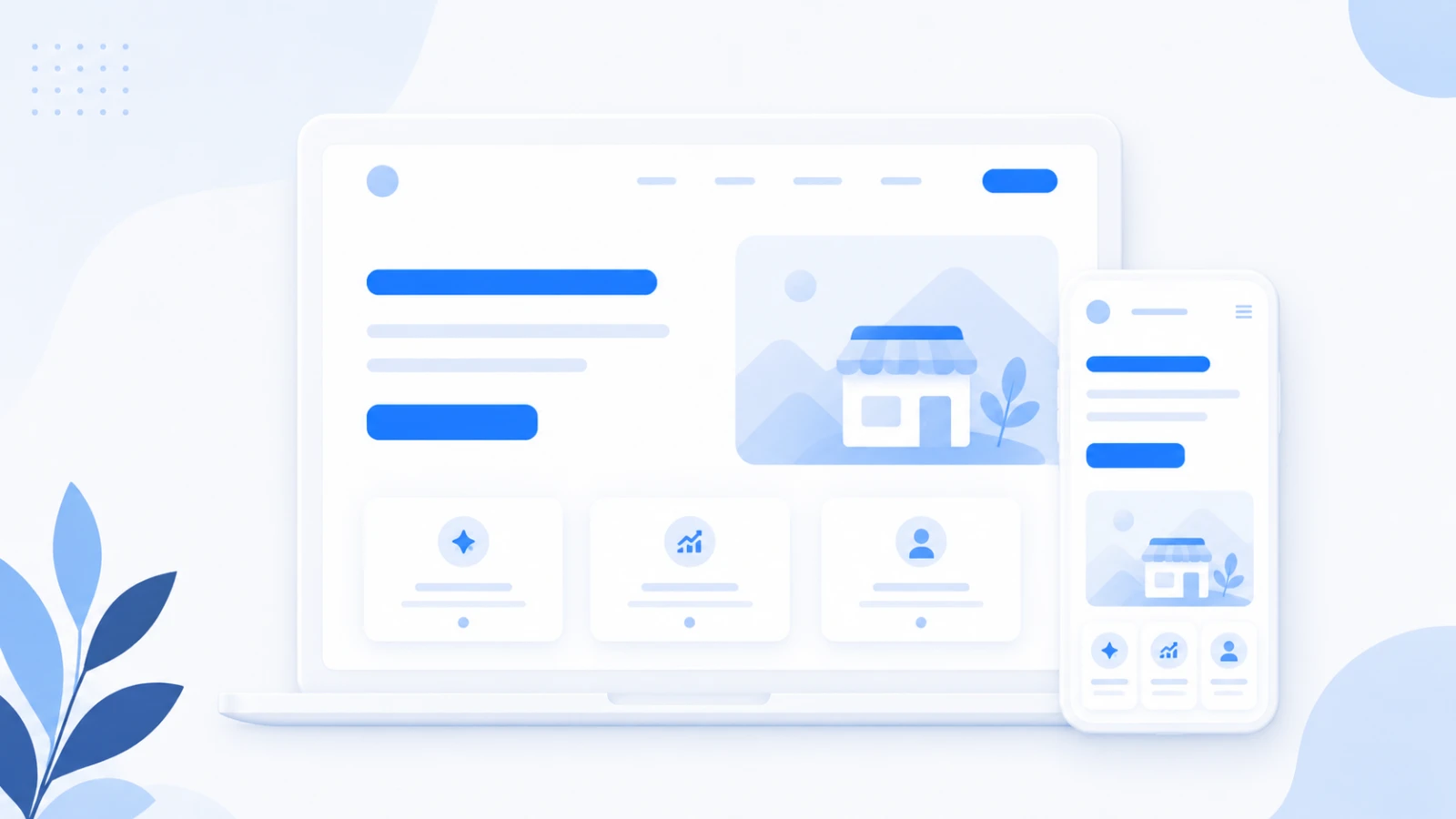
The pages that do the work
You need fewer pages than you think, each doing one thing:
- Home: what you do, proof you can do it, and a clear next step.
- Services: one page per main service, written for the customer searching for that exact thing.
- About: who they'll be dealing with. People hire people.
- Contact: phone, email, a short form, the area you cover. Make it effortless.
Everything else (blog, gallery, long FAQ) only earns its place once those four are pulling their weight.
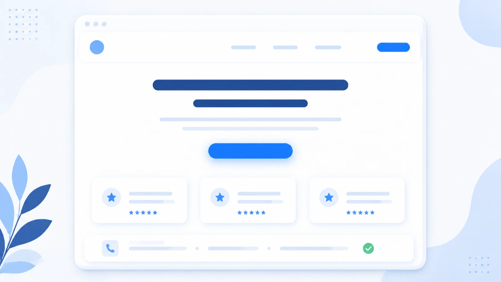
Proof beats adjectives
"Trusted" and "premium" are claims. A photo of real work, a Google review with a name on it, a recognisable logo, a number you can stand behind: those are proof. One real testimonial outperforms a page of confident copy.
If you can't describe a page's job in one sentence, it isn't ready to design. Write the sentence first, then build around it.
A clear next step on every page
Every page should make the next move obvious: call, get a quote, book a time. One primary action, repeated. A visitor should never have to hunt for how to reach you.
Fast, and readable on a phone
Most of your visitors are on a phone, often on mobile data. A site that loads in a couple of seconds and reads cleanly on a small screen will out-convert a prettier one that stalls. Speed helps both your ranking and your conversions.
Something you can update yourself
A site you can't change is a slow liability. Prices move, services change, a new photo comes in. You should be able to update the words and images yourself, without a developer and an invoice every time.
What you can skip (for now)
- A long "our story" no one reads. A short, honest About is plenty.
- Stock photos of people who don't work there. Real photos, or none.
- Animations that delay the content. Movement should help, not gate.
- A blog you won't keep up. One good page beats ten stale ones.
A small-business site doesn't need to be big. It needs to say what you do, prove it, load fast, and make the next step easy. If you want one built around what actually brings in work, tell us about your project.
More from Insights
Let’s build something.
Start a project